Capps’ Kitchen Makeover!
I can’t believe it. FINALLY my kitchen renovation is fully complete! We moved in 3 1/2 years ago, and my husband and I are slowly updating the house as funds and time come available. We started on our kitchen 2 years ago and have literally gone step by step. And let me just say, the wait was worth it.
The kitchen is the room where I spend 75% of my awake time at home. So it is one of the MOST important rooms in the house to me (along with my master bedroom). We wanted it to not only be nice, but an expression of who we are. So we decided to go “all out!”
After much research, browsing stores, consulting with friends, browsing online, lots of saving and DIY hard work….
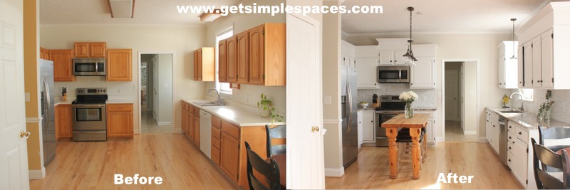
Drastic right?! I actually forgot to take the before picture until after I had removed the knobs from the cabinets, they were white porcelain. We started with builder-grade cabinets, box lights, no island, and white walls. Oh, and a 6 inch deep sink. I’ll share more on that later 🙂
The existing cabinets were real wood, but way too small for our 9 foot ceilings. Total design mistake. In order to save money, we brainstormed and researched how we could use the existing cabinets.
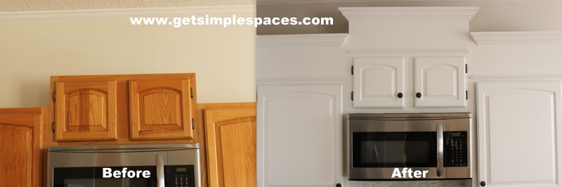
My husband built boxes to go on top of the existing cabinets and fitted them with trim. It gives the illusion that the cabinets are taller than they actually are. We didn’t necessarily need extra storage space (especially up high where we wouldn’t be able to reach). So this was a cost-effective way to fill the space and make them beautiful! We sanded and primed everything and used Benjamin Moore paint – Advanced Self Leveling. The only paint I will use for cabinets or furniture!
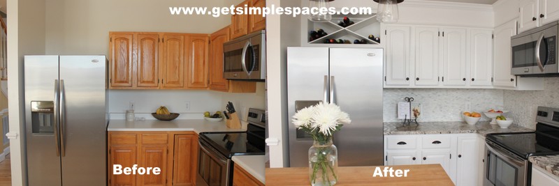
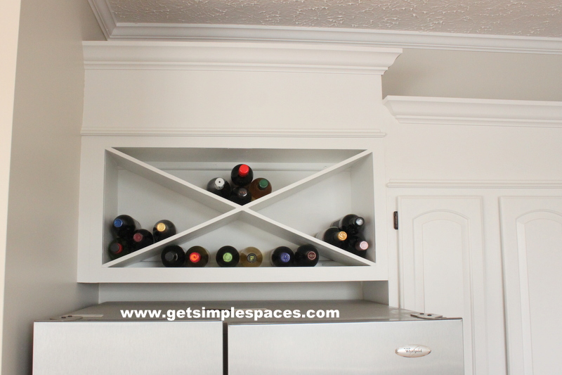
Also, there was no cabinet over the refrigerator, which made it look very odd. It gave that “something missing” feeling. Since we didn’t necessarily need extra storage space (especially a space that would be hard to reach), we decided on a wine cabinet. We bought a regular cabinet, ripped off doors and shelf, and my husband built the “X” inside and a box on top to match our others. We are so pleased in how it turned out.
Now for the other side….
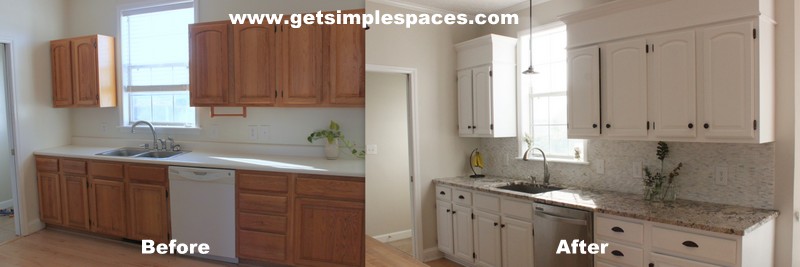
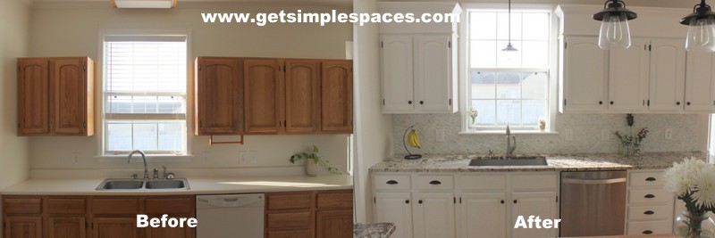
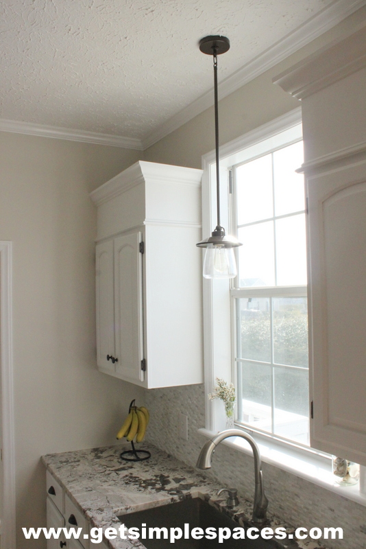
For the sink, I wanted something that I could wash large pots in. When I put one pot in the shallow double-sided sink, it looked like the sink was full! Dirty dishes were piled high on the side of the sink as I cooked. Also, I rinse as a wash, so there was really no need for a sink with two sides. We went with this DEEP farmhouse sink.
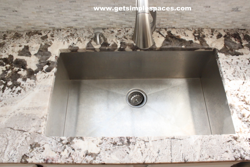
I absolutely LOVE it!
After much consideration, we decided to go with granite for the countertops. We chose something with a base white that had a lot of variation – no square inch of the stone is the same. Some parts are even a little iridescent. Nature inspires me, and I love knowing that I have a little piece of the earth in my kitchen. The granite is called Bianco Antico and was installed by Mid Atlantic Countertops. Sink was also ordered and installed from Mid Atlantic.
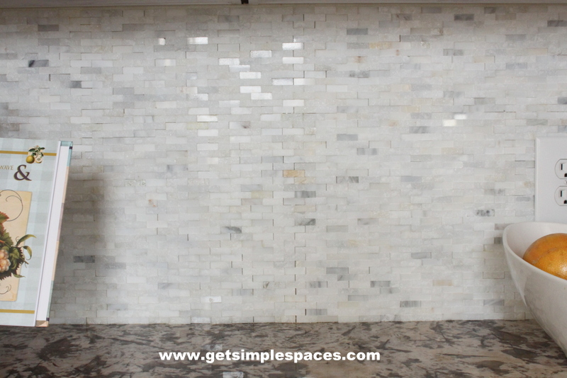
For the backsplash, we decided to go with small white tile, but needed something with a little added color and texture. This mosaic tile is Grecian White purchased at Home Depot.
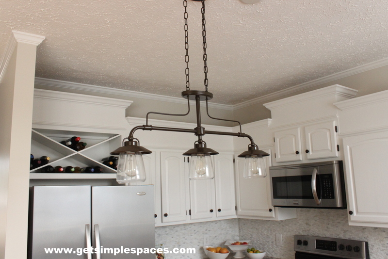
For lighting, we chose this antique style with clear globes and Edison bulbs that look REALLY cool at night! I was concerned about the light being too dim (because we went from fluorescent strips to this) but I actually appreciate the lower light at night.
To me, the island pulls the whole kitchen together. It also provides a space for the kids to have their snack, or my husband and I to enjoy a glass of wine together while the kids have their weekly movie night.
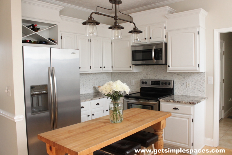
Needless to say, I LOVE spending time in my kitchen! Even if it means hours of cooking, prepping, and washing. You should love the space you’re in. It makes all the difference.
I’ve enjoyed sharing another part of my home with you! I look forward to more reveals as we continue to make it ours 🙂
MelissaGet Organized. Simply Live.
